Success in the restaurant industry depends on being noticed by consumers and standing out from the competition. Restaurant signage is a frequently ignored but useful tool for grabbing customers’ attention, communicating messages, and ultimately boosting sales. In this article we will give tips on how to use restaurant signage to your advantage!

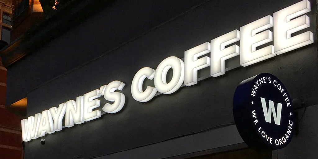
Your restaurant’s external signage is extremely important when it comes to attracting customers and persuading them to enter:
Clear visibility: Make sure your signage is clearly visible and stands out from the surrounding area. To ensure maximum visibility, take into account the font, size, and colour of your signs.
Branding: The logo, colours, and general aesthetic of your restaurant should all be reflected in the outdoor signs. Consistency in branding enhances and strengthens the reputation of your restaurant.
Visual cues: It’s also a smart idea to use visual design cues on your signage. It gives customers a better idea of what to expect. For example placing an icon of a country flag, pizza or hamburger, could help to clearly identify your restaurant… unless of course the Name is the identifier – such as “Pizzeria Luigi”.
Set the vibe: It’s also beneficial for customers to know not just what kind of food and drink you serve, but also what kind of atmosphere and “vibe” they can expect. This can be done through the use of suitable fonts and colour. A black sign with stainless steel sans-serif writing can suggest a high-end, contemporary fine dining experience, or warm hues and a traditional-looking font could represent an old-fashioned, family-run business.
Special offers: Use your exterior signage to promote special offers, happy hour deals, or upcoming events. This can entice potential customers to enter and try your restaurant.
All companies need high standards of professionalism, but the food service industry is particularly vulnerable to negative consumer perceptions if it appears that things aren’t being handled with seriousness behind the scenes. Unfortunately, patrons of a restaurant with a disorganised front of house are prone to wonder how the kitchen looks.
The signage above your restaurant door serves as a first impression to guests about how scrupulously you keep your standards; therefore, an outdated, unclean, or damaged sign is not a suitable representation of the condition of your food prep rooms.

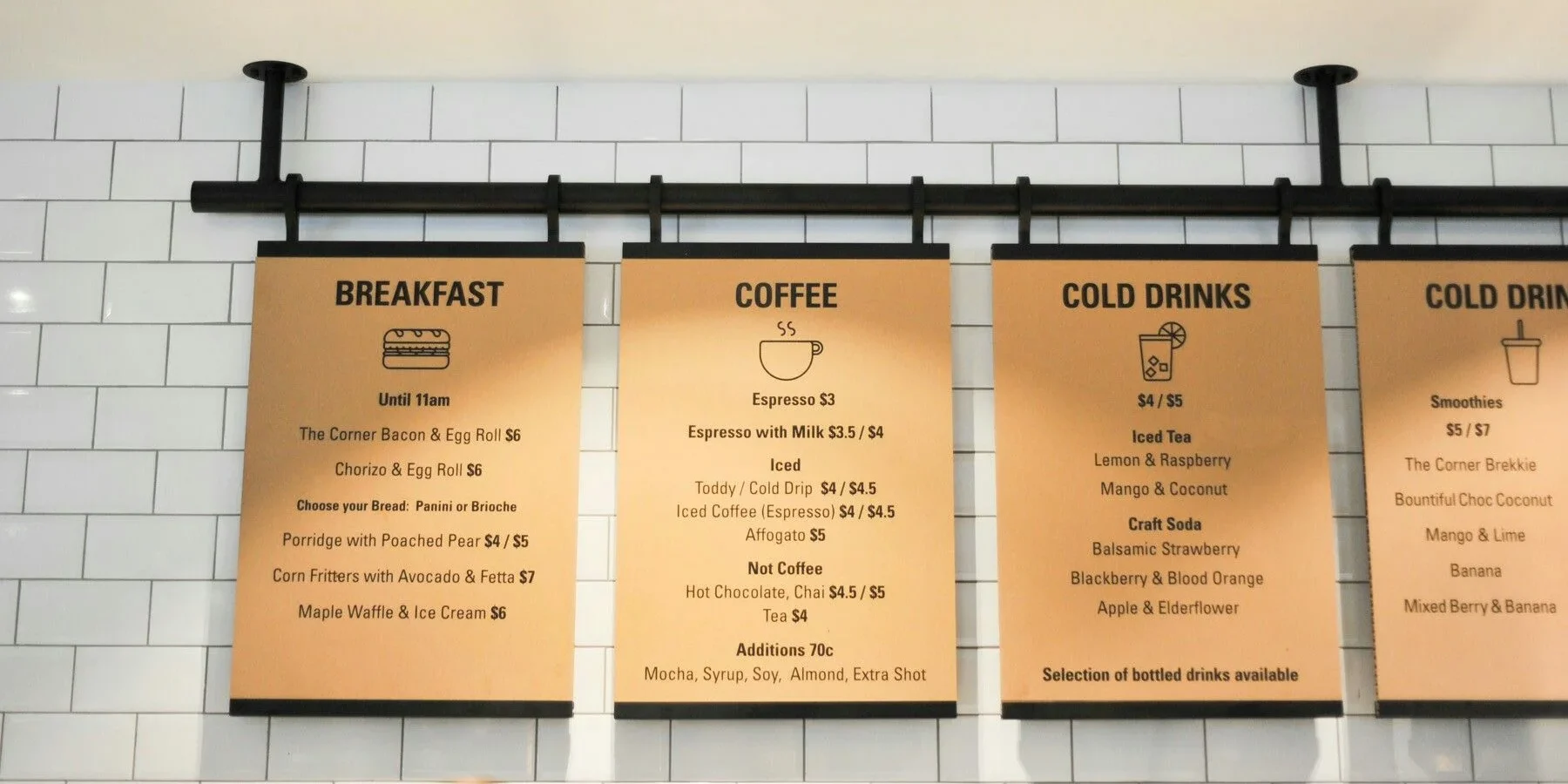
Menu boards are a great way to highlight your offers, draw clients in and boost sales. Here are some tips on how to make your menu boards effective:
Clarity and simplicity: Make sure your menu boards are organised and simple to read.
Highlight specials and suggestions: Use visual cues like borders, bold fonts, or images to draw attention to your daily specials, chef’s recommendations, or popular dishes. This can help increase sales of high-margin or signature items.
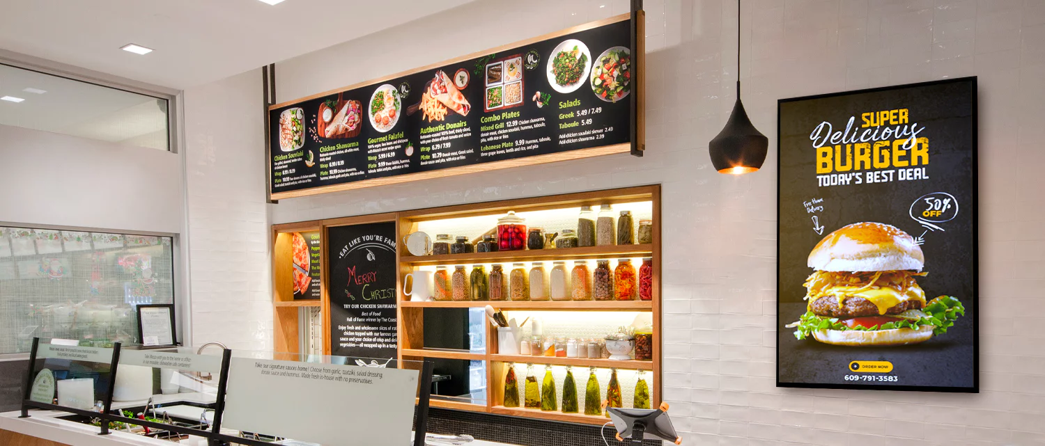
Visual appeal: Incorporate mouth watering images of your dishes on the menu.

Indoor signage is essential for enhancing the experience of patrons once they enter your restaurant. Think about the following:
Directional signs: Use signage strategically to guide customers to different areas of your restaurant, such as the bar, restroom, or outdoor seating. Clear and informative signage reduces confusion and improves the overall customer experience.
Digital displays: Consider adding digital menu boards or displays that can be quickly changed to show off daily deals, offers, or future events. This gives the ambiance of your restaurant a dynamic element and creates a sense of urgency.
Tabletop displays: Place tabletop displays that highlight special menu items, desserts, or drink options. Customers may be encouraged to browse more of your menu as a result, which will boost add-on purchases.
Effective restaurant signage is a powerful tool for driving sales and creating an experience that diners will never forget. From eye-catching exterior signage to captivating menu boards and strategic indoor signage, each element plays a crucial role in attracting customers and increasing revenue.
You can guarantee a seamless client experience from the moment they step foot in your restaurant by utilising a restaurant booking system in conjunction with your signage initiatives. Make your signage stand out by using creativity, and watch your sales rise!

Unlock the tips that will help you stand out from the crowd and get more bookings!

Learn how to save time, reduce stress and fill your restaurant while you sleep!

Gen-Z marketing coordinator bringing fresh energy to web and graphic design, with a weekend habit of chasing adventure.

Gen-Z marketing coordinator bringing fresh energy to web and graphic design, with a weekend habit of chasing adventure.


Call us
Malta: +356 2033 0096
UK: +44 845 154 3698
USA: +1 (415) 231 3696
Spain: (900) 645443 (Free)
Argentina: +541151990515
Italy: (800) 769470 (Free)
Lithuania: +370 (6) 4721122
Poland: +48732083322
Resources
Call us
Connect with us
About us
Resources