A professional-looking website is an essential resource for any restaurant. Not only does it serve to communicate your brand and offerings, it is an important tool to attract customers.
A recent study conducted by Toast shows that 32% of diners check restaurant websites before visiting!
With this in mind, we’ve come up with seven design tips that will make your restaurant website stand out and provide your patrons with an engaging online experience.
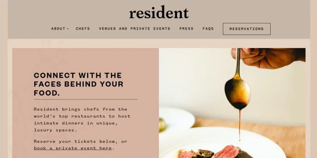
Like with anything, first impressions count. Keep in mind that a visually appealing theme not only draws attention, but it also conveys the distinct personality of your business.
Choose a colour scheme that goes well with the logo and ambiance of your restaurant.
Include eye-catching photos that highlight your menu, space and atmosphere. You can also find a selection of free food photography for use online.
Use typefaces and typography that are consistent with the look and feel of your brand.
Your website must have a simple, user-friendly navigation system. The last thing you want is for people to get frustrated and lost navigating the website.
Use a website menu with a simple, logical layout and categories.
Make sure the sections for your menu, contact details and reservations are simple to find on every page.
Create a search function so that users may locate certain information easily.
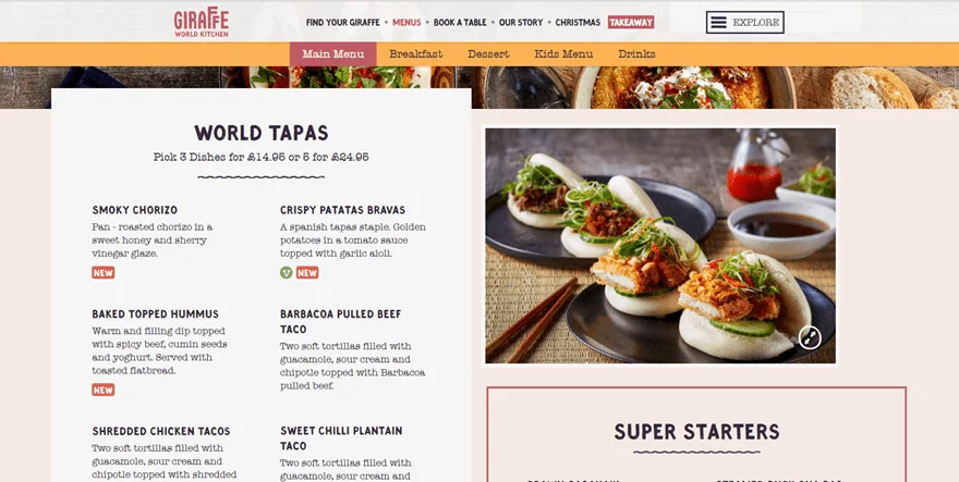
A key element of your website is the menu. Potential customers’ attention might be piqued with the help of a tasty and attractive menu. Make it informational and eye-catching:
Present your menu in an easy-to-read layout with distinct sections for the various courses or cuisine styles.
Give each dish enticing descriptions and top-notch pictures.
Emphasise any particular dietary options or seasonal cuisine.
Check out more tips in our menu design tips article.
Make sure your website is mobile-friendly because checking out restaurants on mobile devices like smartphones and tablets is the norm. Take into account these suggestions:
Use a responsive design to ensure that your website adapts to various screen widths.
Increase page loading speed to avoid lagging or irritated visitors.
Forms and site navigation should be made simpler for mobile users to deal with.
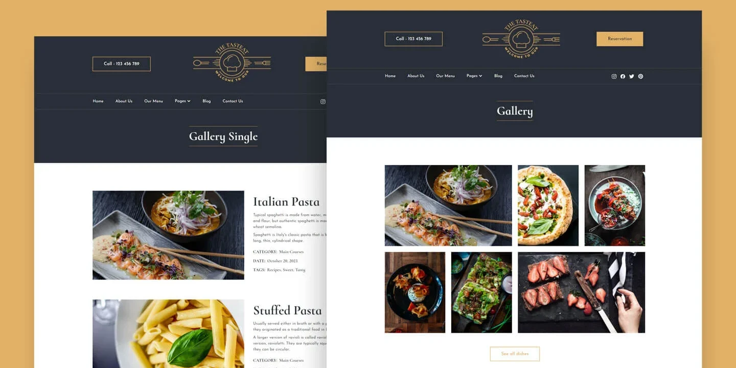
Your website should reflect the ambiance and distinct qualities of your restaurant in addition to showcasing the mouthwatering dishes you serve.
Include high-resolution pictures of your interiors that depict the ambiance and furnishings.
Include pictures of your bar area, outside furniture and any unique amenities you provide.
To give visitors a virtual tour of your place, think about including virtual tours or 360-degree pictures.
Strong social proof of the calibre and level of service at your restaurant can be found in client endorsements and reviews. The following is how to add them to your website:
Positive comments should be highlighted prominently on your site or a testimonials page.
Display authentic customer reviews along with the names and, if feasible, accompanying images of the reviewers.
Use review widgets from well-known review websites like Google or Yelp to display user comments in real time.
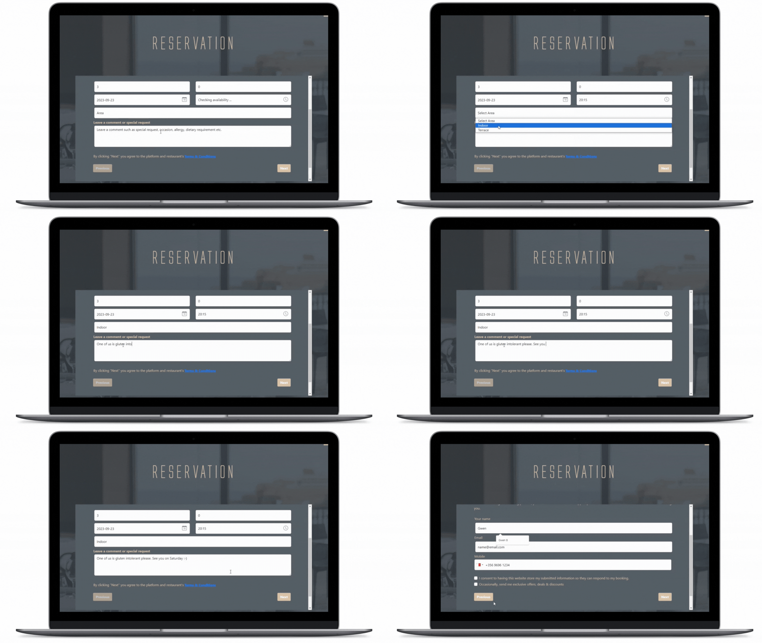
By including an online booking widget to your website, you improve customer satisfaction and operational efficiency. Tableo also offers a free restaurant reservation system – especially useful if you are a small restaurant. This will enable you to:
Give clients the option to book straight through your website for a simple and convenient booking experience.
Improve overall efficiency, cut wait times and improve table management.
Collect consumer information and preferences, to customise the eating experience and enable targeted marketing initiatives,
So there you have it! You can improve your restaurant’s online presence and give your guests an immersive experience by embracing appealing aesthetics, streamlining navigation, showing menus, utilising responsive design, accentuating ambiance, incorporating testimonials and integrating a reservation system.
Keep in mind that a well-designed website not only draws visitors but also makes it easier for them to go from exploring to visiting, to returning. Adopt these design concepts, uphold your brand identity and remain flexible to meet the changing demands of your online audience.
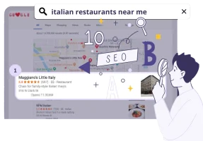
Unlock the tips that will help you stand out from the crowd and get more bookings!

Learn how to save time, reduce stress and fill your restaurant while you sleep!

Gen-Z marketing coordinator bringing fresh energy to web and graphic design, with a weekend habit of chasing adventure.

Gen-Z marketing coordinator bringing fresh energy to web and graphic design, with a weekend habit of chasing adventure.


Call us
Malta: +356 2033 0096
UK: +44 845 154 3698
USA: +1 (415) 231 3696
Spain: (900) 645443 (Free)
Argentina: +541151990515
Italy: (800) 769470 (Free)
Lithuania: +370 (6) 4721122
Poland: +48732083322
Resources
Call us
Connect with us
About us
Resources